This topic may not related to the columbarium design but when I was looking for an idea of portrait photography, I also needed to look at the space that containing this art pieces.
Gallery is the space to display art works. the space usually be the empty hall with the display walls. But the interesting point of designing gallery is how to control space and lighting. Space circulation in the hall must lead the direction of people to each exhibit hall step by step. Lighting control is also important, designers must know the basic theory of using light for the gallery space and which type of lights are the most appropriate to the art works.
For the architecture, gallery space can be from the small room to the huge art museum. I was looking on the specific design that might be related to my design and only to study on how do they work on the exhibition space to be my inspiration for my own project.
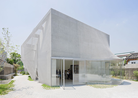
Kukje Gallery, South Korea by SO-IL
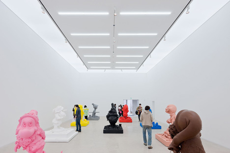
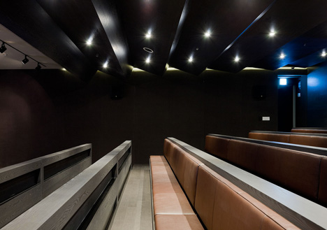
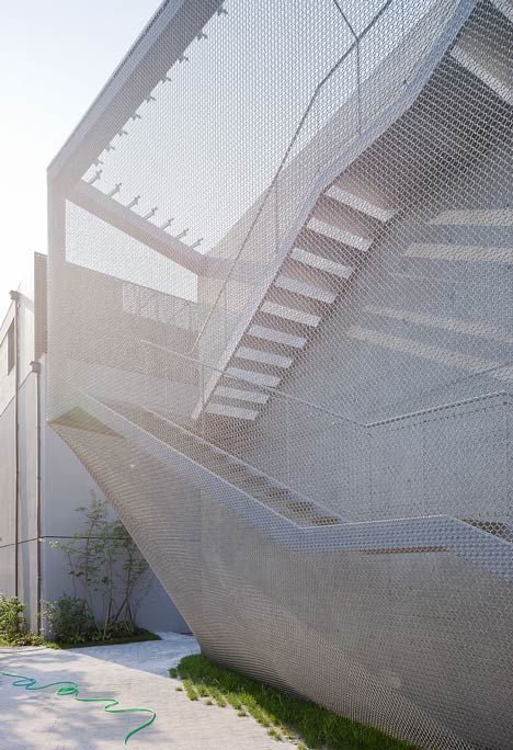
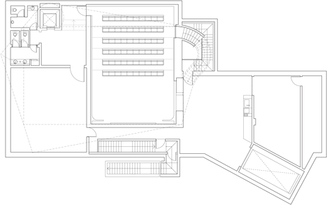
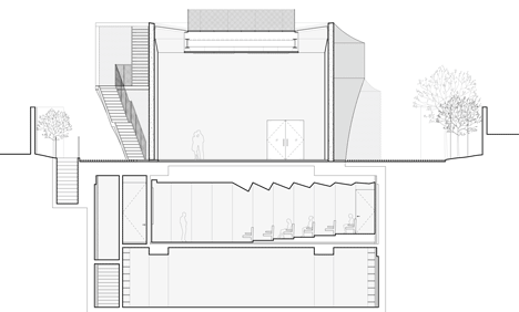
The architectural proposal resolves a perceived disjunction between the dynamism and boldness of Kukje Gallery’s organization and artist roster, and the fragile historic fabric saturated by materials and details that surrounds the site. Studies led to a soft and ambiguous building that gently nestles itself into the site. Circulation—entries, vestibules, elevators and stairs—has been pushed out of the orthogonal gallery space to maximize its height and maintain a clear interior volume. Considering the diagrammatic box geometry too rigid within the historic fabric, SO–IL enveloped the building in a mesh veil, creating a nebulous exterior that changes appearance as visitors move through the site. A custom stainless steel mesh produces a layer of diffusion around the structure, through a combination of reflections, openness, and moiré patterns produced through the interplay of its shadows. The mesh, made out of 510.000 individually welded rings, is strong yet pliable as it wraps around the building’s irregular geometries. The result is an abstract ‘fuzzy’ object that accommodates a multiplicity of readings.
Daeyoung Gallery and House by Steven Holl
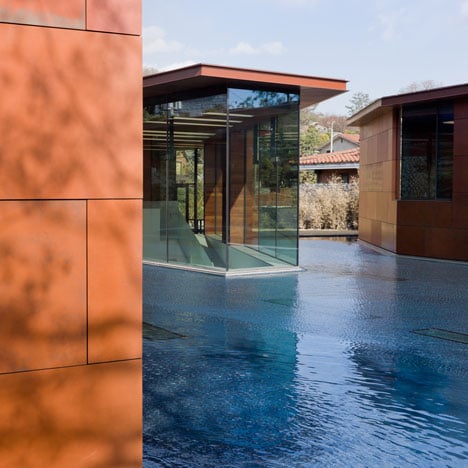
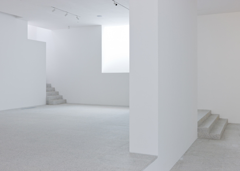
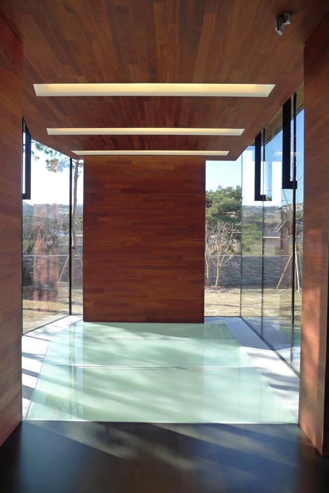
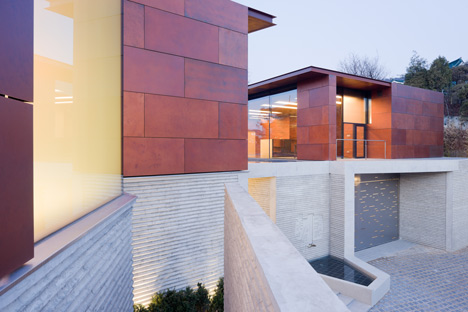
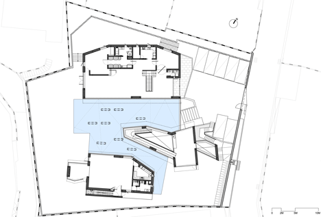
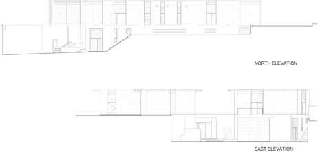
The basic geometry of the building is inspired by a 1967 sketch for a music score by the composer Istvan Anhalt, “Symphony of Modules,” which was discovered in a book by John Cage titled “Notations.”
No comments:
Post a Comment